


Scope: Packaging, Illustration
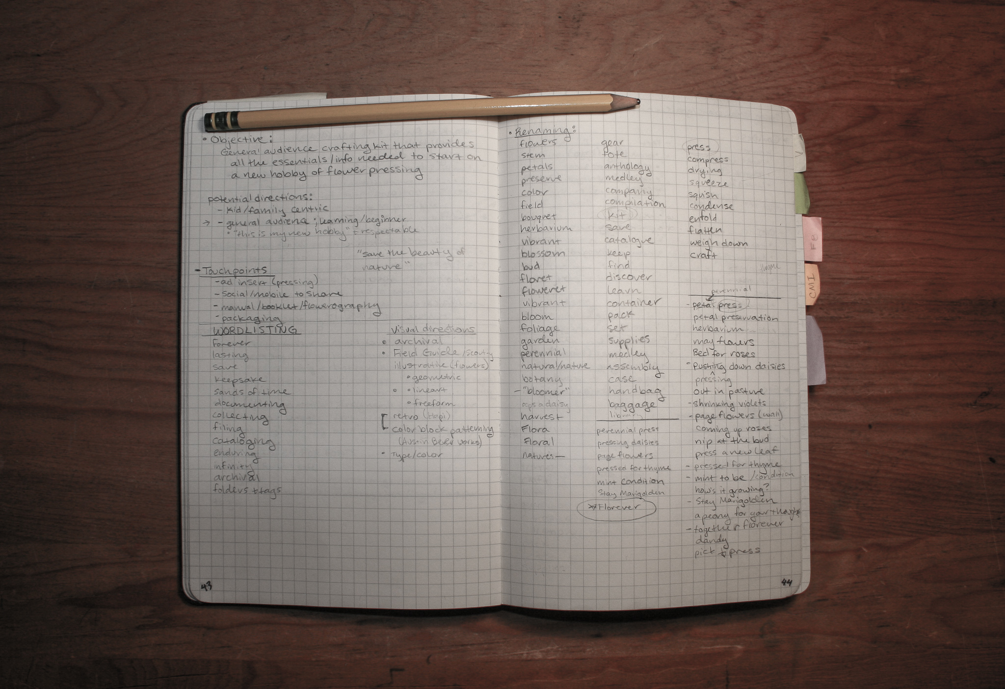
Florever
For those looking to pick up a new hobby or maybe just a quick all-in-one gift for a friend, Florever is a basic flower pressing kit for beginners with everything you need to get started.
Created with the idea that flower pressing and general crafting is often overlooked as trivial pursuits, Florever set out to give a sense of dignified presence to the classic craft.
Identity
Known most for it's romantic and Victorian leanings, flower pressing also has a lengthy history in scientific and archival work, all stemming back to a direct interaction and connection with nature.
The Florever identity is a composite of a few aspects of flower pressing's history, the romantic era legacy, the clerical documentation, and the adventurous scouting field guide. All in the context of the modern, do-it-yourself craft atmosphere.
Mark
The Florever brand introduces itself through a simple and elegant word mark. The serif typeface gives the impression of respectability while the all lowercase stylization gives a sense of quiet and calm, like whispering in the library. The intent was to portray a notion of dignity and integrity while not becoming too inaccessible or intimidating.
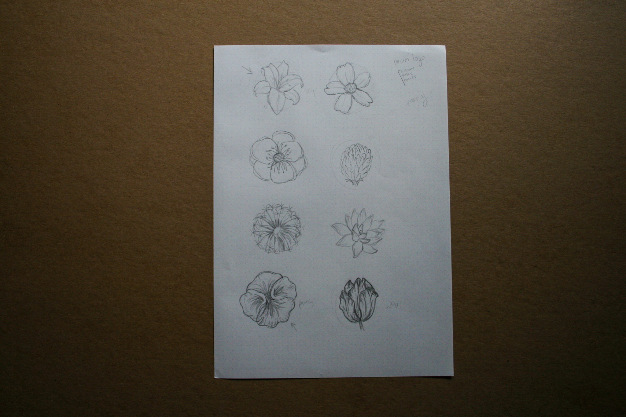
The secondary visual motif, a line art rendering of a rose, speaks more to the modern side of flower pressing: the scouting movement and independent outdoor field guides. The rendering of the rose has a more graphic quality than illustrative, moving away from the archival illustrations of a classical age. However, paired in the context of a cohesive kit, the mark becomes collaborative effort to represent the multifaceted history of the craft by combining both old and new.
Color
Navy blue was chosen for its formal, distinguished, and respectable connotations.
Teal was chosen as a softer pairing to continue the theme of balance and add a touch of a pastel green to accent the strong blue.
Type
Bookman Old Style is used for the word mark and headlines, stylized in an all lower case theme. The traditional serif typeface was chosen for its classical suggestions and elegant feel.
Trade Gothic LT Std Condensed was chosen for all other type applications. Secondary headlines are stylized in an all caps fashion, but body copy uses a mix of caps and lowercase for legibility. The condensed font visually alludes to the days of field guides and nature manuals with their direct and instructional approach.
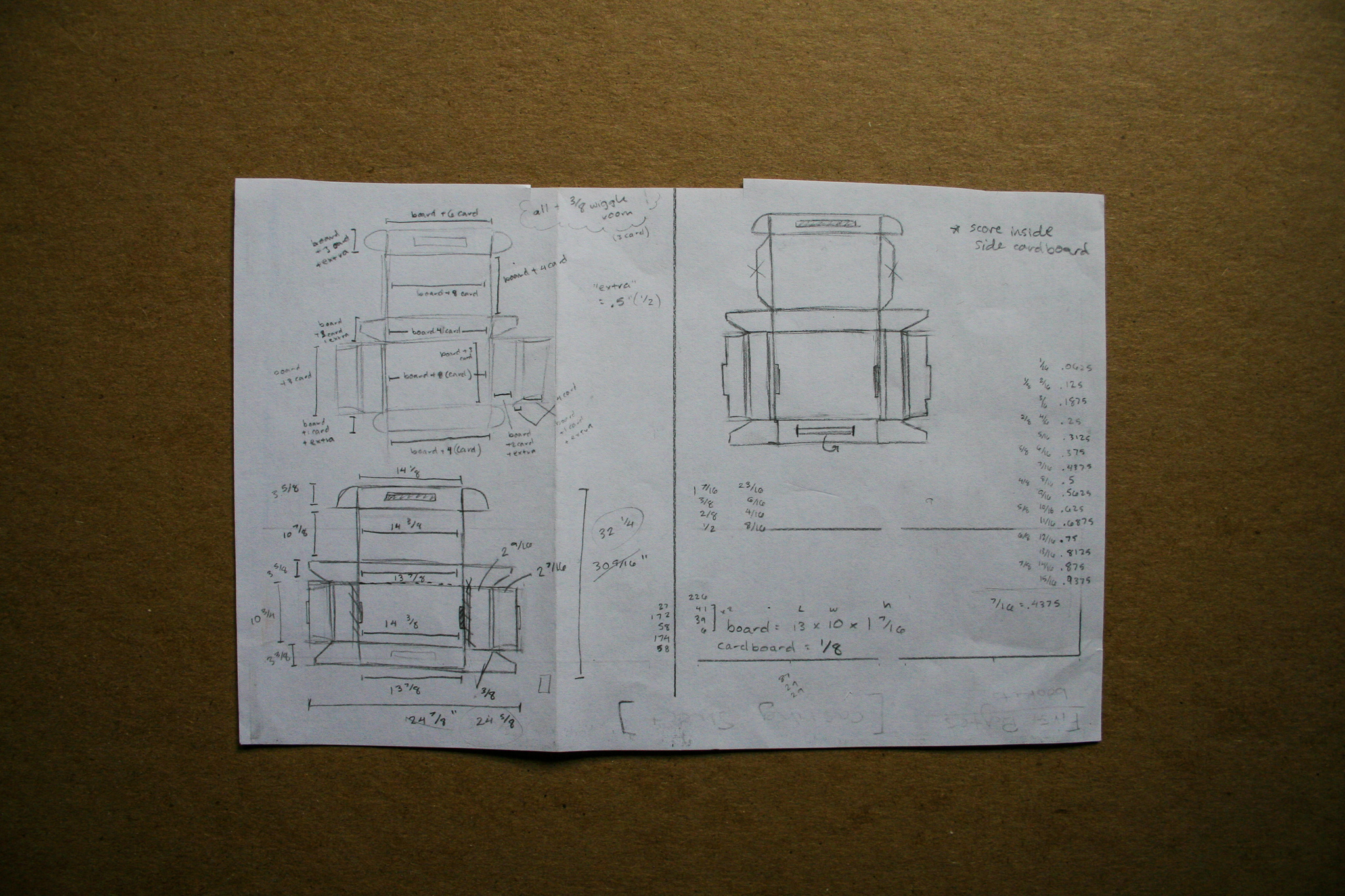
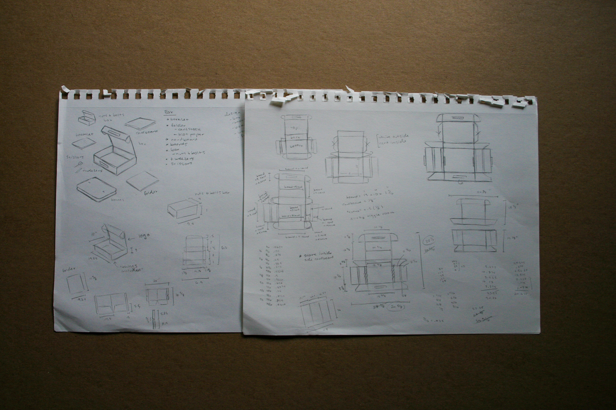
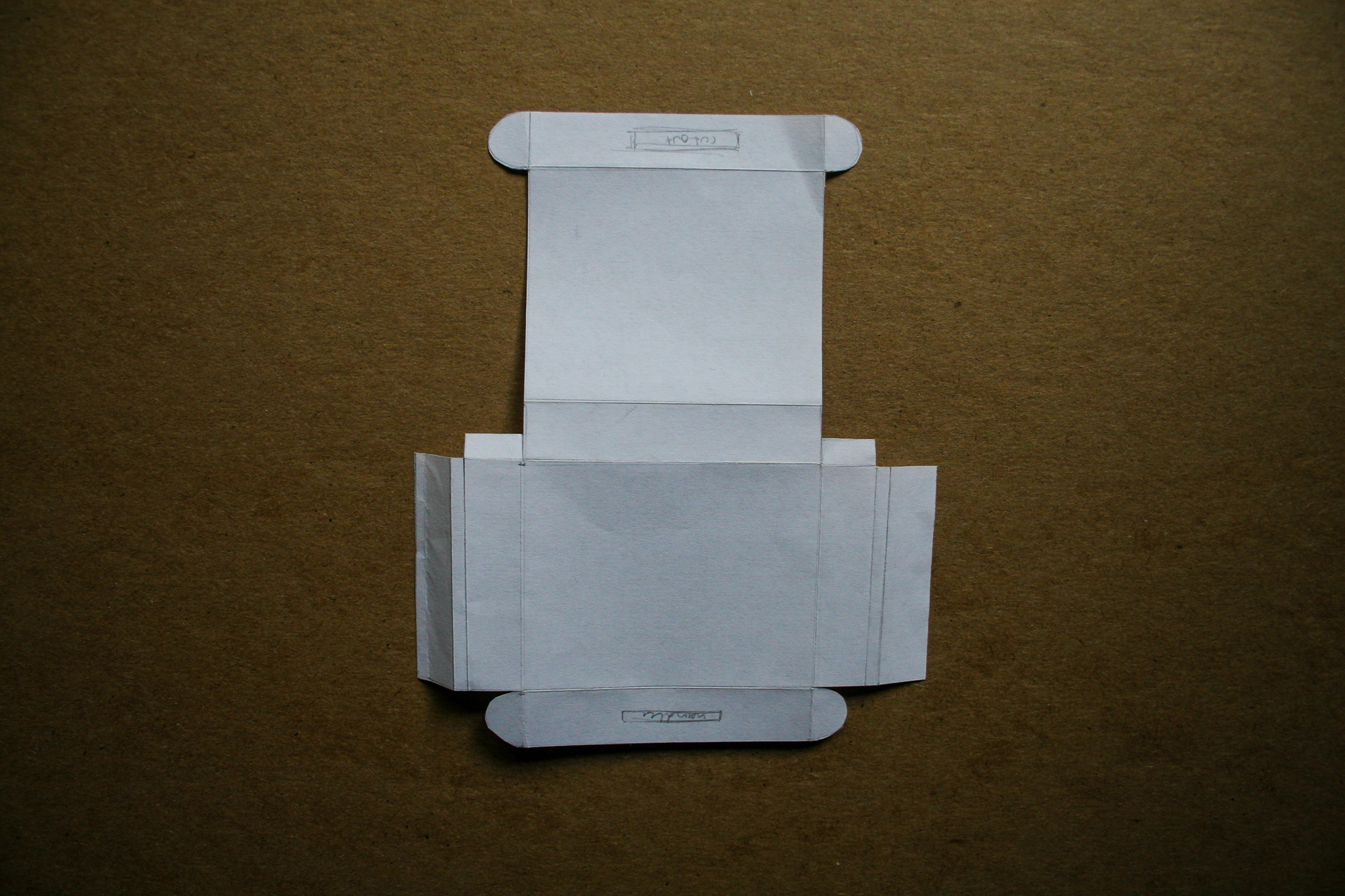
Packaging
The flower press kit itself comes in a housing box that has the option to be packed up and taken along on outings, with its practical carrying handle. The box is made from sturdy, crafty cardboard that has been classed up a bit by means of a white exterior.
Included in the collection is two wooden pressing boards, a box with the accompanying press supplies of screws, washers, and wingnuts, a sturdy folder with blotting paper and pressing paper (which could perhaps house future creations), two pieces of cardboard for the press, a pair of scissors, a pair of tweezers, and a booklet with instructions on getting started.

Booklet Insert
The included booklet provides tips on how to choose flowers, information about the press itself, and a short step-by-step walkthrough of the the process of pressing flowers. In the back, there is plenty of space for notes on discoveries made while adventuring.

Process work
Thanks for scrolling!